Anuncios

Streaming app interface differences reveal how digital platforms adapt their design to completely different devices and usage environments. Developers deliberately restructure layouts, navigation logic, and content presentation so viewers can comfortably discover and watch videos across televisions, smartphones, and tablets.
Streaming platforms rarely display identical interfaces across devices because each screen size demands a unique interaction model. Designers evaluate viewing distance, input methods, hardware performance, and user behavior before building interfaces that feel natural on televisions, phones, and tablets.
A streaming interface on a television prioritizes simplicity and readability because viewers sit several feet away from the screen. Phone interfaces instead emphasize quick navigation and touch gestures since users hold devices close and interact constantly with their thumbs.
Tablet interfaces occupy a middle ground between televisions and smartphones by combining touch interaction with larger display areas. Designers therefore experiment with hybrid layouts that resemble television grids while preserving the tactile navigation experience expected on mobile devices.
Streaming platforms must also account for operating systems, hardware limitations, and media playback capabilities that vary dramatically between devices. These differences influence how menus appear, how recommendations are organized, and even how playback controls behave during video streaming sessions.
Anuncios
Understanding why streaming interfaces change across devices helps explain broader trends in digital product design. Platforms continuously refine layouts to optimize discovery, engagement, and comfort regardless of whether the user watches from a living room television or a handheld screen.
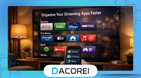
Screen Size and Viewing Distance Shape Interface Layout
Television interfaces prioritize large visual elements because viewers typically sit two to four meters away from the screen. Large thumbnails, bold typography, and horizontal carousels help users quickly identify content without straining their eyes during relaxed viewing sessions.
Phone interfaces focus on compact layouts because screen space remains extremely limited compared with televisions. Designers must balance readability, navigation, and content density so users can scroll through recommendations comfortably without excessive zooming or constant interface adjustments.
Tablet screens allow designers to display more information than smartphones while maintaining comfortable touch navigation. Many streaming apps therefore adopt multi-column layouts on tablets that combine elements from both television grid designs and vertically scrolling mobile interfaces.
Streaming platforms carefully evaluate visual hierarchy when adapting layouts across devices. Content thumbnails, category labels, and playback controls must remain recognizable regardless of whether users interact through remote controls, touch gestures, or physical navigation buttons.
On televisions, the interface highlights fewer items per screen to prevent overwhelming viewers who browse from across the room. Smartphones instead display longer scrolling lists because users expect to swipe rapidly through many options while holding the device.
Another key design difference involves typography scaling across device categories. Television apps use larger fonts to maintain readability at distance, while mobile interfaces reduce text size slightly to maximize the amount of visible content.
Designers also adjust the spacing between interface elements depending on the expected interaction method. Remote controls require large selectable targets, while touch interfaces demand precise spacing that prevents accidental taps on nearby buttons.
Streaming companies invest heavily in usability testing to ensure these visual adjustments improve navigation efficiency. Real households often participate in testing programs that measure how quickly viewers locate shows or movies within different interface structures.
Ultimately, screen size and viewing distance represent the most visible factors influencing streaming interface differences. These environmental conditions shape the foundation upon which every other design decision for televisions, phones, and tablets is built.
++How Soundbars and External Speakers Change the TV Experience
Input Methods Change How Users Navigate Content
Input mechanisms strongly influence how streaming apps organize menus and navigation flows across devices. A television remote offers directional buttons and limited shortcuts, while smartphones rely primarily on gestures and tablets support a mixture of both interaction styles.
Television navigation focuses on directional movement across rows of content tiles. Users press arrow keys to jump between categories and thumbnails, creating an interface structure that emphasizes horizontal browsing rather than the vertical scrolling common on smartphones.
Mobile streaming apps rely heavily on swipe gestures and touch interactions to accelerate browsing speed. Vertical feeds, collapsible menus, and floating playback controls allow users to explore large libraries quickly without the friction associated with remote-based navigation.
Designers also integrate gesture shortcuts into mobile interfaces that would be impossible on televisions. Swiping to minimize a video player or double tapping for quick playback adjustments creates a fluid experience optimized specifically for touch-driven environments.
Tablet devices introduce hybrid navigation possibilities that combine touch gestures with larger layout grids. Because tablets offer more screen space, developers frequently include side menus, expandable categories, and preview panels that remain visible during browsing.
Streaming companies often publish design guidelines explaining these platform differences. For example, the research and design documentation from Nielsen Norman Group highlights how interaction patterns must adapt to both input limitations and user expectations across digital devices.
Developers must also consider accessibility when adapting navigation structures. Television apps often include simplified menu hierarchies so users of all ages can comfortably browse with minimal button presses.
Mobile interfaces, by contrast, frequently incorporate advanced features such as voice search and gesture shortcuts. These capabilities allow users to bypass traditional navigation paths and locate specific content more efficiently.
As a result, the same streaming service may feel like three different products depending on the device. Interface designers intentionally restructure navigation systems to match the capabilities and limitations of each interaction method.
++The Real Difference Between Live TV and On-Demand Streaming
Device Performance Influences Interface Complexity
Hardware performance significantly affects how streaming interfaces appear and behave on different devices. Smart televisions often contain slower processors compared with modern smartphones, which forces developers to simplify certain animations and transitions.
Mobile devices typically offer stronger processors and graphics capabilities than many smart television platforms. This advantage allows developers to integrate smooth animations, dynamic previews, and real-time content loading without compromising playback stability.
Streaming services must carefully optimize memory usage when designing television interfaces. Excessively complex layouts can cause slow navigation or delayed loading on older televisions that lack the processing power available in modern smartphones or tablets.
Tablets usually deliver performance levels similar to smartphones while offering larger displays. Developers therefore treat tablets as premium mobile platforms where richer interface elements, larger preview thumbnails, and expanded browsing menus can operate smoothly.
Performance considerations also affect how quickly thumbnails load while browsing content libraries. Faster devices can preload artwork and preview clips more aggressively, creating smoother navigation experiences compared with slower television platforms.
Streaming platforms also optimize network requests differently across devices. Television interfaces often minimize background loading to prevent buffering interruptions, while smartphones can prefetch additional data thanks to stronger processors and faster connectivity.
Technical performance testing helps developers maintain consistent experiences across hardware environments. The engineering guidelines published by the Android Developers documentation explain how device capabilities influence interface rendering and resource management.
Performance limitations sometimes explain why certain interface features appear first on mobile devices before arriving on televisions. Developers often test new recommendation displays or discovery tools on smartphones where hardware constraints are less restrictive.
These performance realities illustrate how interface differences reflect deeper engineering tradeoffs. Designers must align visual ambitions with the technical capabilities of each device category to maintain smooth streaming experiences.
Content Discovery Strategies Differ Across Devices
Streaming platforms prioritize different discovery strategies depending on how viewers browse content on each device. Television users often explore recommendations slowly, while smartphone users tend to scan quickly through large catalogs.
Television interfaces frequently highlight curated rows of content organized by genre, popularity, or personalized recommendations. These rows help viewers make relaxed viewing decisions while sitting comfortably in front of a large screen.
Mobile streaming apps typically emphasize search functionality and algorithmic recommendations more heavily. Because users interact frequently throughout the day, smartphones often display dynamic feeds that update based on recent viewing activity.
Tablets again occupy a hybrid role between televisions and phones. Their larger displays allow streaming services to present multiple recommendation panels simultaneously while maintaining the touch-based navigation expected on mobile platforms.
Streaming companies constantly analyze user behavior to refine these discovery layouts. Platforms examine how long users browse, which thumbnails attract attention, and how often viewers abandon menus before selecting content.
Research published by the Pew Research Center highlights how device preferences influence media consumption habits across different demographic groups. These behavioral insights help streaming companies refine recommendation layouts across televisions and mobile platforms.
Another key discovery feature involves autoplay previews that appear while browsing. Television apps often display silent video previews in large thumbnails, whereas mobile apps use smaller previews to preserve screen space.
Recommendation algorithms also adjust how frequently suggestions update depending on device usage patterns. Mobile interfaces may refresh recommendations more frequently because users interact with the app multiple times throughout the day.
These strategic adjustments ensure that discovery feels intuitive regardless of the viewing context. Whether browsing casually on a couch or quickly searching during a commute, the interface guides viewers toward content efficiently.
++How Streaming Platforms Decide When to Remove Movies and Series
Typical Interface Differences Across Devices
Streaming services frequently maintain separate interface templates for televisions, phones, and tablets. These templates reflect the design principles, hardware capabilities, and interaction patterns discussed throughout this article.
| Característica | TV Interface | Phone Interface | Tablet Interface |
|---|---|---|---|
| Navigation Style | Remote directional navigation | Touch gestures and vertical scrolling | Hybrid touch navigation |
| Thumbnail Size | Large cinematic tiles | Smaller compact thumbnails | Medium grid layouts |
| Content Density | Fewer items per screen | Many items per scroll | Balanced multi-column layout |
| Playback Controls | Simple remote-friendly overlay | Gesture-based controls | Expanded touch controls |
| Search Method | On-screen keyboard | Voice and typing | Touch keyboard and voice |
Television interfaces emphasize simplicity above all else. Large buttons, minimal menus, and slower browsing patterns ensure viewers can comfortably navigate without frustration while using a remote control.
Phone interfaces instead prioritize speed and responsiveness. Compact layouts allow users to browse hundreds of titles quickly through scrolling feeds and recommendation panels optimized for rapid exploration.
Tablet interfaces combine visual richness with touch-friendly interaction zones. Developers frequently implement side panels, expanded content descriptions, and larger thumbnails that benefit from the additional screen space tablets provide.
Another major difference involves multitasking capabilities on mobile devices. Smartphones and tablets often allow picture-in-picture playback while users browse other content or switch between applications.
Television platforms typically avoid such multitasking features to maintain a focused viewing experience. Designers prefer to keep playback controls simple and unobtrusive so the main content remains the primary visual element.
These interface variations illustrate how streaming apps behave more like adaptive ecosystems than static products. Each version evolves to match the device environment while maintaining brand consistency across the platform.
Understanding these structural differences helps users appreciate the design complexity behind modern streaming services. What appears as a simple layout adjustment often reflects extensive research into user behavior and technological constraints.
Conclusión
Streaming platforms design distinct interfaces for televisions, smartphones, and tablets because each device creates a different viewing environment. Distance from the screen, interaction method, and hardware capabilities all shape how digital media interfaces must behave.
Television viewing typically occurs in relaxed living room environments where simplicity and readability dominate design decisions. Large thumbnails, minimal menus, and remote-friendly navigation create an interface optimized for comfortable browsing from several meters away.
Smartphones represent the opposite viewing context. Users interact rapidly with touch gestures while holding the device close, which encourages compact layouts, fast scrolling feeds, and gesture-based controls that prioritize efficiency.
Tablet devices occupy a middle ground that combines the advantages of both televisions and smartphones. Their larger screens allow richer content displays while maintaining the intuitive touch navigation that mobile users expect.
Streaming companies must also balance design goals with technical limitations. Hardware performance differences between devices force developers to adapt animation complexity, content loading strategies, and interface responsiveness.
User behavior analytics plays an essential role in shaping these design choices. Streaming platforms analyze how people browse content on each device to continuously refine recommendation layouts and navigation structures.
The evolution of streaming interfaces also reflects broader trends in digital product design. Modern applications increasingly adapt their layout dynamically depending on screen size, interaction method, and performance capabilities.
These adaptations ensure that users experience consistent functionality across devices even when the visual interface changes significantly. Brand identity, recommendation logic, and playback reliability remain stable regardless of platform.
As streaming ecosystems continue expanding, interface design will likely become even more adaptive. Emerging technologies such as voice navigation, AI-driven discovery, and immersive displays will further reshape how users explore content.
Ultimately, the differences between streaming interfaces across televisions, phones, and tablets demonstrate how thoughtful design bridges technology and human behavior to deliver seamless entertainment experiences.
Preguntas frecuentes
1. Why do streaming apps look different on TV compared with phones?
Television interfaces must remain readable from a distance and work with remote controls, which requires larger thumbnails, simpler menus, and horizontal browsing layouts.
2. Why do mobile streaming apps use vertical scrolling?
Vertical scrolling allows users to browse large libraries quickly using touch gestures, which feels more natural on handheld devices.
3. Why are thumbnails larger on TV streaming apps?
Viewers sit farther away from televisions, so larger thumbnails improve visibility and help users identify content quickly.
4. Why do phones often have more features than TV versions?
Smartphones typically have stronger processors and more flexible interaction methods, enabling advanced features like gesture controls and multitasking.
5. Why do tablets have different layouts than phones?
Tablets provide larger displays that allow multi-column layouts and expanded content descriptions while still supporting touch navigation.
6. Do streaming companies design each interface separately?
Yes, developers usually create device-specific interface frameworks that adapt navigation, layout, and interaction patterns for televisions, phones, and tablets.
7. Why do recommendations sometimes appear differently across devices?
Recommendation systems adapt layouts to match browsing behavior, which varies significantly between relaxed television viewing and quick mobile browsing.
8. Will streaming interfaces become more similar in the future?
While design elements may converge slightly, interfaces will likely remain device-specific because viewing environments and interaction methods continue to differ.